|
This was commission that I received a ways back and only recently finished. The rough is pretty "comprehensive", as they say but I changed the spacing of the elements and decluttered things a bit. Those sci-fi pillars are there for design purposes mainly: The Vision is looking upward (maybe having a vision of the SW) and I wanted to have something moving the viewer's eye up... an upward thrusting. And I wanted to have a dream like quality to the environment, and hence, keep things vague. So instead of trying to draw a lab or something like that, I opted for free-floating pieces of machinery that might suggest the Vision's android nature. [Quick marker rough below, followed by final piece] 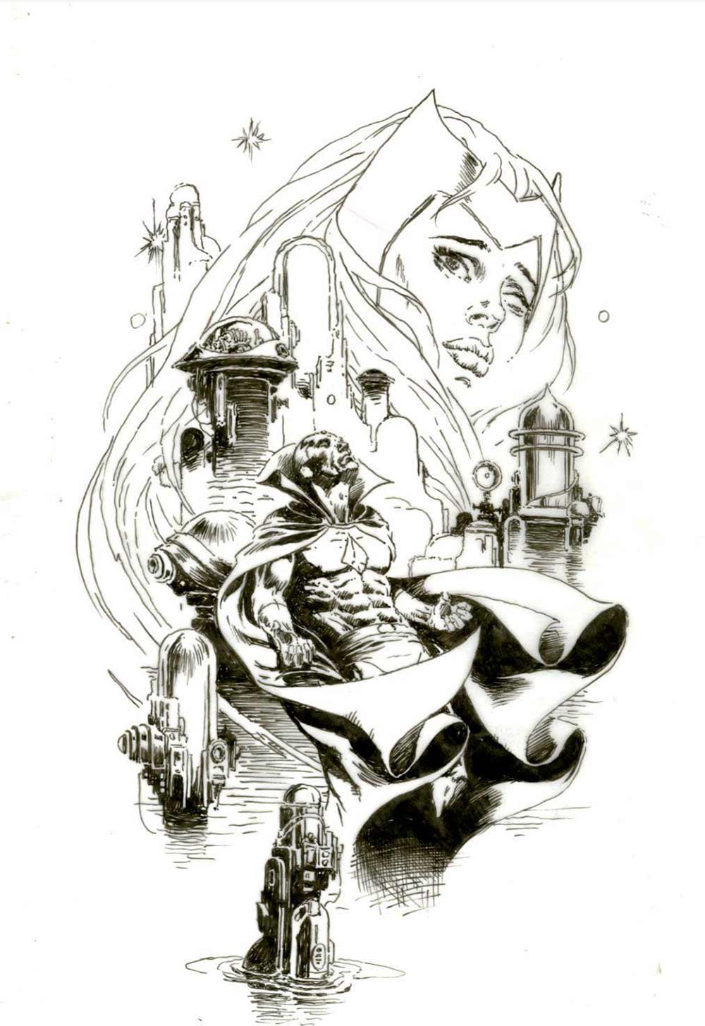 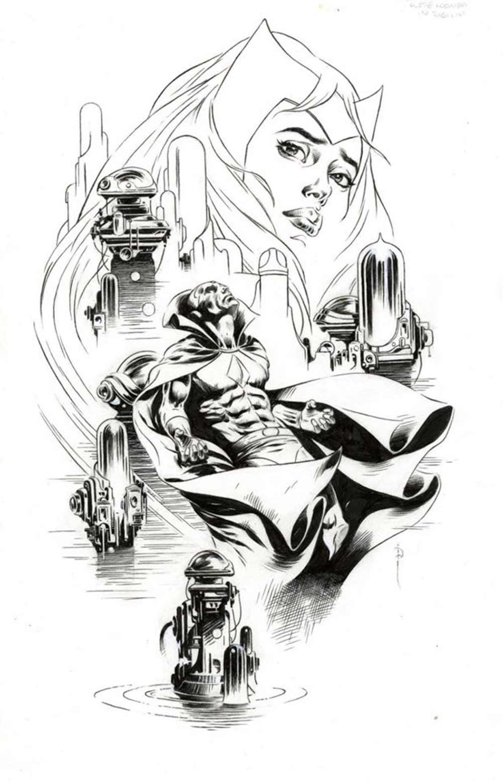 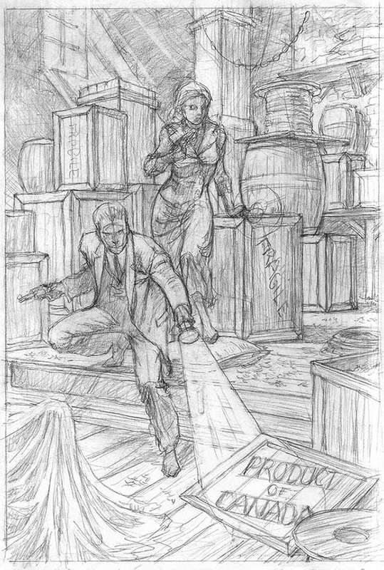 Jim asked Sandy about the above sketch
Sandy: Not much to say about this piece cause all the details are lost in the misty corridors of my memory. Got a call one day when I was still in NYC from a company developing roll playing games, ala D+D. They wanted me to do the illustrations/character designs for the project. It was to have a crime noir, 1930's setting. This all sounded good and I drew up this rough, following a detailed description of the scene. Sent them a xerox (yes, that long ago.) They loved it. Raved about it. And I never heard another word from them or about the project. So it goes. 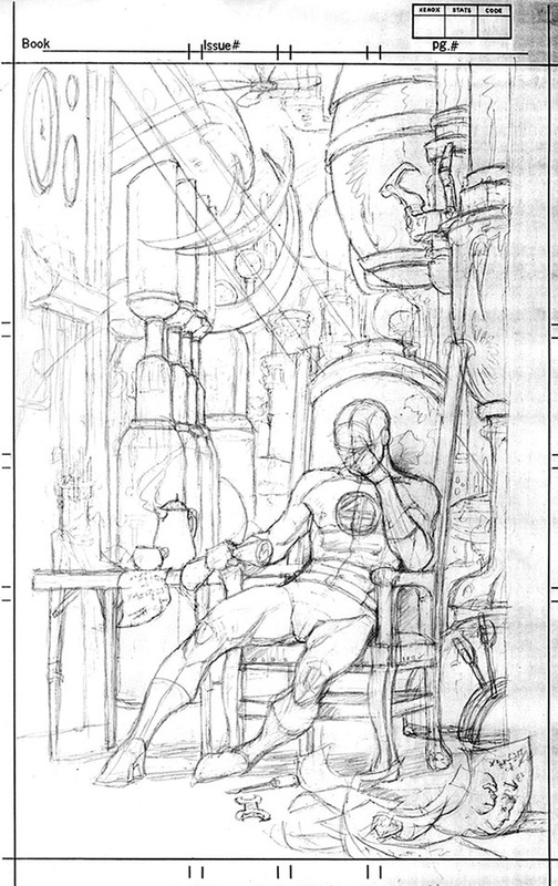 Jim asked Sandy about a sketch he did of the Fantastic Four's Mr. Fantastic. Sandy: In the mid 80's, editor Al Milgrim decided to go with an all pin-up issue on Marvel Fanfare. The artists assigned were given carte blanc- no restriction on characters or other content. This drawing of Mr. Fantastic was the first sketch I came up with. Thought it was a pretty neat idea, fairly original given most pin-ups being done were full of fists and fury. This was more cerebral, and if successful, it would pull at the viewers heartstrings. But it dawned on me that it probably would communicate with maybe 2% of the audience, those who knew that one of the great superhero melodramas involved the relationship that existed between Reed Richards and Ben Grimm (aka The Thing). Reed had been responsible for Ben's transformation into the monstrous Thing and thus separating the tormented Ben from the rest of humanity. Much space in early issues of the Fantastic Four was devoted to Reed's attempts (and failures) to reverse the process. Tragedy on a Shakespearian level. Really! Anyway, the drawing was meant to depict Reed at a point of despair, presumably having been frustrated once more in his attempts to come up with the right formula to help his good buddy reenter humanhood. Much as I liked it, I just didn't think people would get it. So, I went this a drawing of the Scarlet Witch, surrounding by primordial familiars (she is a witch, after all). There was an option of doing full color on these pin-ups and so my original black and white art was developed into a "blue-line", which meant that you, the artists, painted onto a blue reproduction of the art with the black line work printed on a separate acetate overlay. Hellish way to color. Scarlet Witch from Marvel Fanfare #45 below (posted by Comicsagogo.com), along with two pieces from Sandy Plunkett's collection. 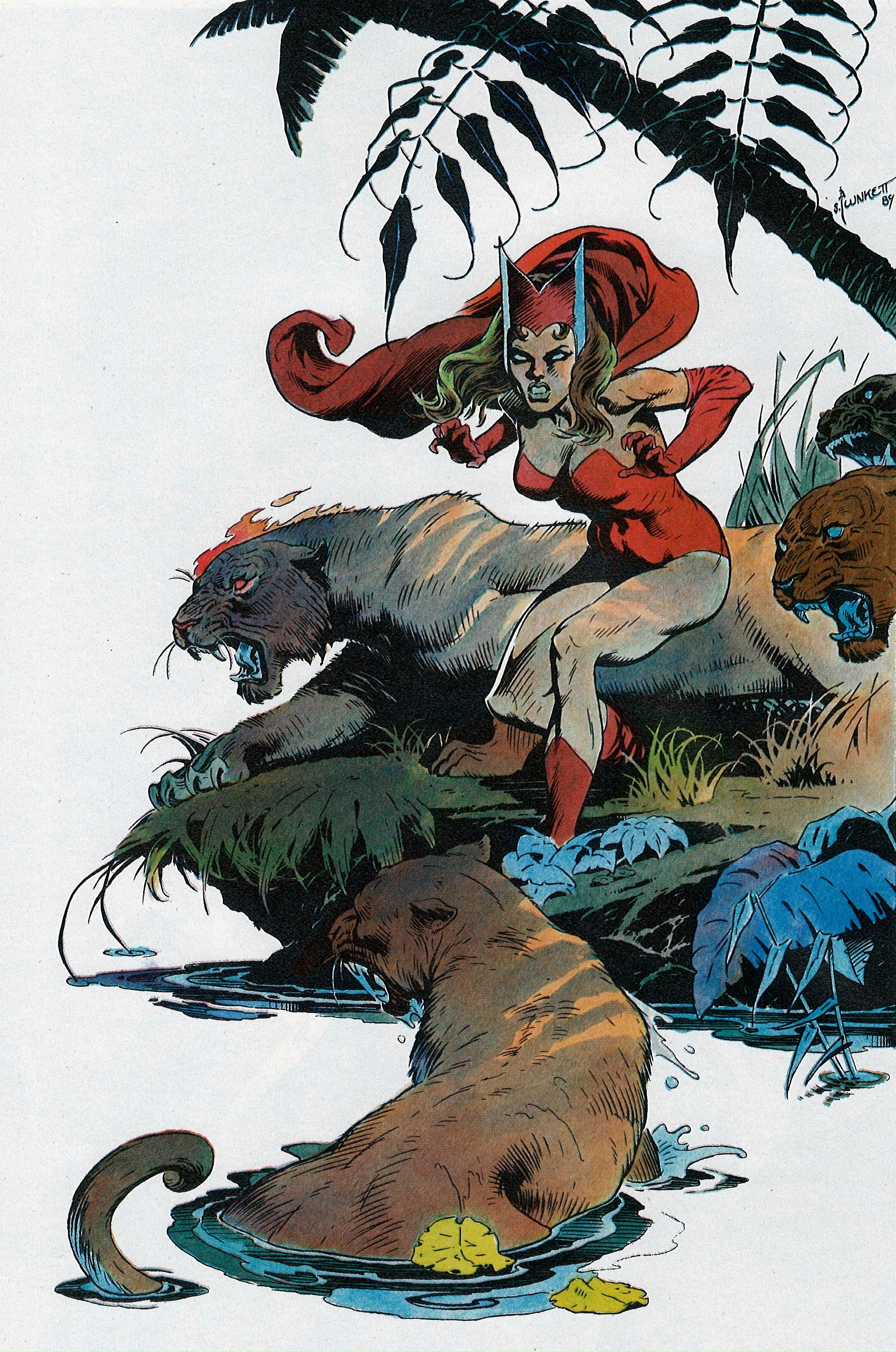 Scarlet Witch By Sandy Plunkett in 1989's Marvel Fanfare #45, a Pinup Issue 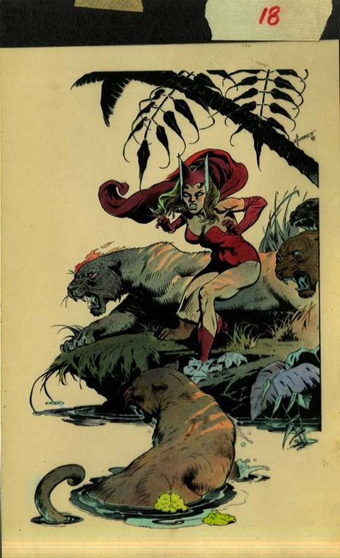 Sandy's Scarlet Witch -- Original blue-line coloring, acetate in place 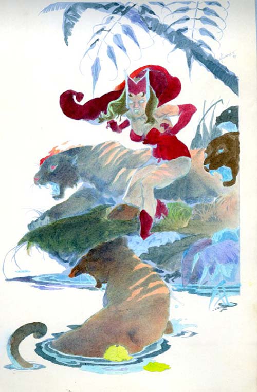 Sandy's Scarlet Witch -- Coloring with acetate lifted off |
BLOGaboutPlunkett-fan Jim Harris interviewing Sandy about past and present projects. Archives
January 2021
Categories
All
|
 RSS Feed