|
This was commission that I received a ways back and only recently finished. The rough is pretty "comprehensive", as they say but I changed the spacing of the elements and decluttered things a bit. Those sci-fi pillars are there for design purposes mainly: The Vision is looking upward (maybe having a vision of the SW) and I wanted to have something moving the viewer's eye up... an upward thrusting. And I wanted to have a dream like quality to the environment, and hence, keep things vague. So instead of trying to draw a lab or something like that, I opted for free-floating pieces of machinery that might suggest the Vision's android nature. [Quick marker rough below, followed by final piece] 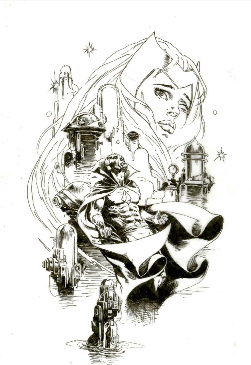 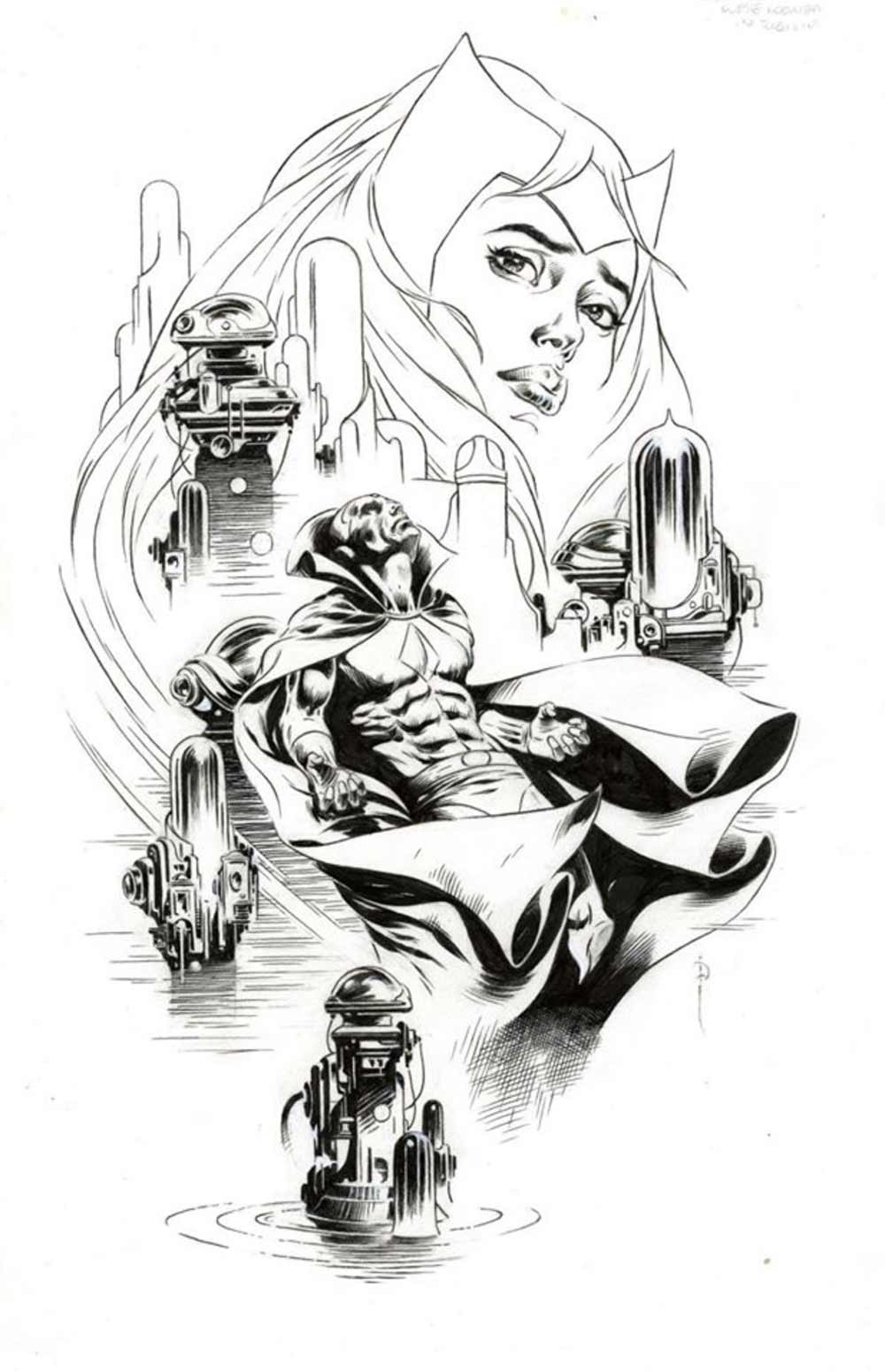 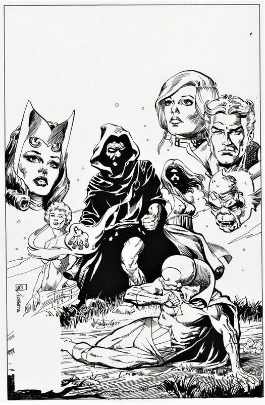 Way back when (early 70s) I was talking to renowned comics writer/artist Howard Chaykin in his upstart studio about my inability to increase my work speed. He suggested that I pick up some cover assignments at Marvel because covers paid rate and a half, as well as having high visibility. Seemed like a pretty persuasive argument for digging up some cover assignments.
By coincidence, the next time I dropped by editor Carl Potts' office, he was struggling with the layout for a Defenders cover. I causally asked if he would be interested in having me take a crack at it. He had me look the script over and, sitting on his office couch, doodled out a rough for the cover above. (I wish things always worked so smoothly in the comics world.) He had Bill Sienkievicz do the inking. I was a bit skeptical of the decision since Bill's approach is/was radically different than mine but really liked the result. See the printed cover 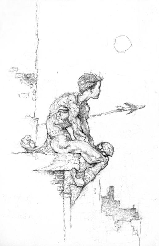 Posted by Sandy on Facebook on July 13:
"It's been a while since I left the multiplex with a spring in my step after seeing a super hero movie, but "Spider-man: Homecoming" was a complete delight. Who would have thought corporations the size of Sony and Marvel Entertainment could produce a movie with a real heart?" |
BLOGaboutPlunkett-fan Jim Harris interviewing Sandy about past and present projects. Archives
January 2021
Categories
All
|
 RSS Feed