|
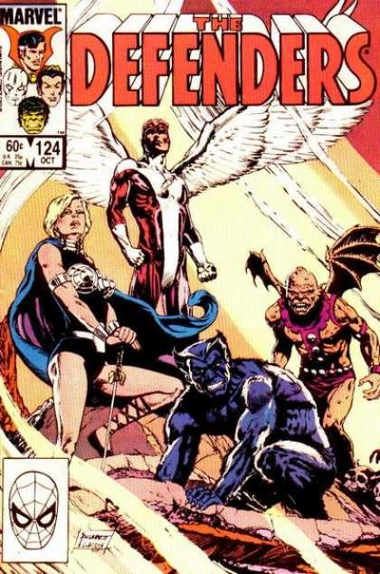
With the recent announcement that Netflix is bringing Marvel's "Defenders" to its services, Jim thought he would ask Sandy about a 1983 Defenders cover.
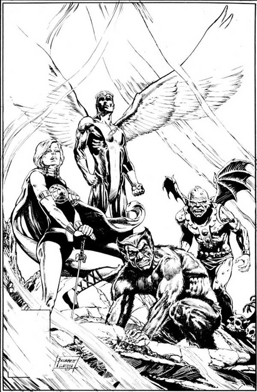
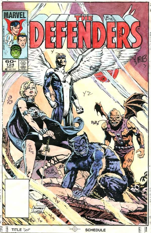
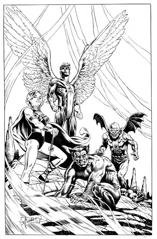
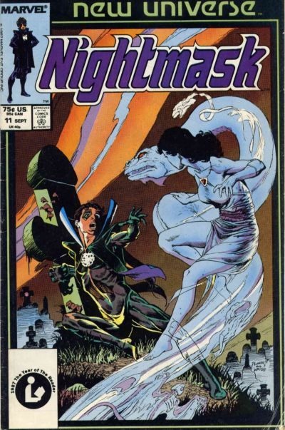
Sandy: Carl Potts was the editor on the Defenders book, a buddy from our days at Neal Adams' Continuity Studios, and if I recall correctly, he pretty much gave me free rein on the cover, letting me do a "symbolic" representation of the group. That is, the scene I came up with didn't have to depict any actual event in the issue. Even by superhero standards, the Defenders was a weird-ass group. I could never get a read on that book (though, yes, it might have helped if I had actually read any of the stories.) The original creators took the most unlikely characters and tossed them into the same title. And the composition of the group seemed to change with mind-spinning regularity. Fortunately, I was under no pressure to include all the team members on the cover and so I cherry-picked, selecting the ones I thought would work well together visually. Alan Weiss did another stellar job inking my pencils and I colored it, as I did all my covers. Years later, a fan commissioned me to do a recreation of the cover. This practice might sound odd to the uninitiated, but fans who missed out on buying the original of a favorite cover sometimes hire the artist to "recreate" the work for them. I have mix feeling about this idea. On the one hand, redrawing a piece gives you the chance to work out all the annoying flubs you committed the first time round. On the other hand, given my propensity for spending an absurd amount of time worrying about minutia, reworking a piece until I get it right isn't a good idea. When I'm at the board sometimes, late at night, I imagine myself some retched character from an Edgar Allan Poe story, neurotically reworking details no one will ever notice on a drawing that'll never be finished. Though I did improve some of the drawing in the recreated version of this cover, my preference is for the original, largely cause Alan's inks are just so gritty and rich with texture. Defenders #124-related images from Sandy's archive are below With a series of questions (below), Jim invites Sandy to review his work on Nightmask #11 (1986)
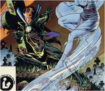
Sandy: I was living at the ironically named Belleclaire (Beautiful Light) Hotel on upper Broadway [in NY] at the time I was doing most of my covers for Marvel. Ironic, because it was in reality as grim welfare hotel (technically called a Single Room Occupancy). Not the place you'd choose to entertain girlfriends. My sister refused to step inside the place, so I'd have to meet her on the corner when she visited. Three murders while I lived there, all prostitutes. Shared bathroom down the hall, sink often strewn with used needles. That being said, I kinda like the place. Unpretentious. I rarely kept track of how long work took me, simply because when I did, the knowledge depressed me. I'd have to face the fact that I was working for about 50 cents/per hour, if I did the math. Maybe it took about five days from coming up with the rough for approval to the finished pencils. (It was inked by Alan Weiss.) Not sure anyone "offered" me the job. Nightmask changed editorial hands from Mike Higgins (a fellow Dead Head at the time) to Bob Harras and Bobbie Chase (asst. ed.) at some point and I just kinda went along with the character, having started working on it for Mike. (Work on the New Universe books was fairly easy to get because the books were such bad sellers and weren't generating any royalties.) A notable point about that specific project was Bob and Bobbie's demeanor the morning I strolled into their office to check out the proof on the coloring. I had done a very detailed coloring guide for the separators and they had completely blotched it (turning his blue costume green, among other things.) The editors tried to soften the mess-up ("it doesn't really look THAT bad") but eventually we ended up laughing about it. The design just sort of arouse in the process of trying to come up with a good image. I liked the flow of the line of Nightmask's figure, a nice gentel curve from armpit through to left foot. For me, that was the focus of the cover. |
BLOGaboutPlunkett-fan Jim Harris interviewing Sandy about past and present projects. Archives
January 2021
Categories
All
|
 RSS Feed