SANDY PLUNKETT
  • Portfolio
    • Commission 1
    • Commission 2
    • Commission 3
    • Eclectica 1
    • Eclectica 2
  • Links
  • Blogs
    • Blog
    • "Pizza Boy" Posts
  • Contact
  • Books

Blog

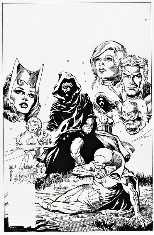
Crack at cover for Defenders #123

6/23/2020

 
image of defenders #123 cover sketch
Way back when (early 70s) I was talking to renowned comics writer/artist Howard Chaykin in his upstart studio about my inability to increase my work speed. He suggested that I pick up some cover assignments at Marvel because covers paid rate and a half, as well as having high visibility. Seemed like a pretty persuasive argument for digging up some cover assignments.

By coincidence, the next time I dropped by editor Carl Potts' office, he was struggling with the layout for a Defenders cover. I causally asked if he would be interested in having me take a crack at it. He had me look the script over and, sitting on his office couch, doodled out a rough for the cover above. (I wish things always worked so smoothly in the comics world.)

He had Bill Sienkievicz do the inking. I was a bit skeptical of the decision since Bill's approach is/was radically different than mine but really liked the result. 

See the printed cover
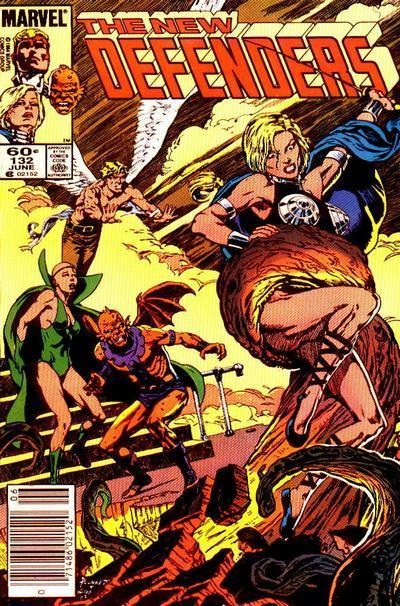
The New Defenders cover

3/31/2016

 
Picture
Jim asked Sandy about the above artwork.

Sandy:


Actually, this is one of the few images posted on this blog that doesn't have a story attached to it. I believe it was the second Defenders cover I did for Marvel. Pretty straight ahead assignment. Though no one ever mentioned a similarity, I got the inspiration for the scene from a Michael Golden Dr. Strange cover that had come out a few months earlier. Not a case of swiping really, but bringing my toe dangerously close to the line. My coloring, and another strong inking job by Alan Weiss.
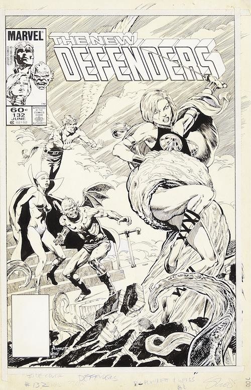
Picture
Another view of this New Defenders cover
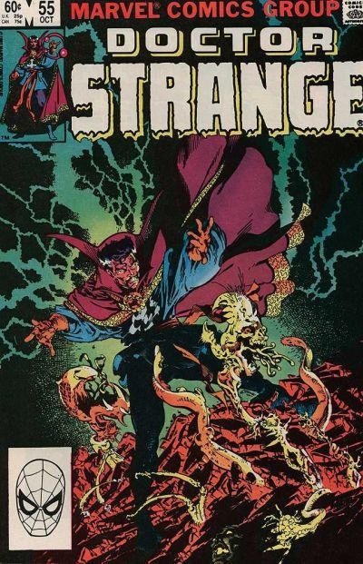
Picture
The Dr. Strange cover Sandy mentions above
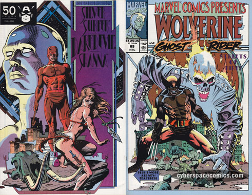
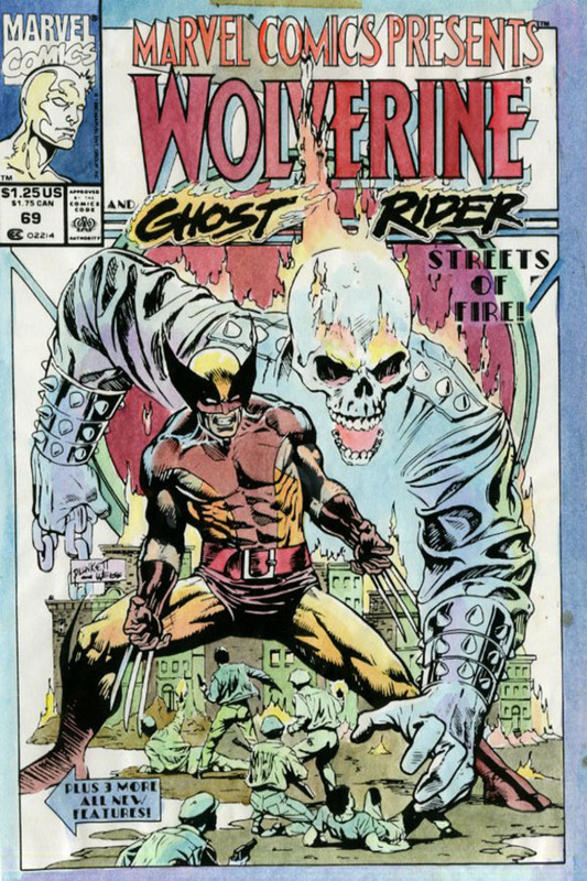
A look back: Marvel Comics Presents Vol 1 #69

8/25/2015

 
marvel comics presents #69 cover from 1991 by sandy plunkett
Jim asked Sandy for his thoughts on his Marvel Comics Presents cover from 1991. 

Sandy:

Not too much to say about this cover really. I believe it was the last one I did for Marvel before moving to Ohio and it's not a favorite of mine. The issue contained the first installment of a four part Daredevil story I wrote, laid out and eventually colored. (My apologies to all those who read this story, by the way- it was a real dog. Whatever I might have learned in the writing of my earlier efforts, I seemed to have totally forgotten on this one.)

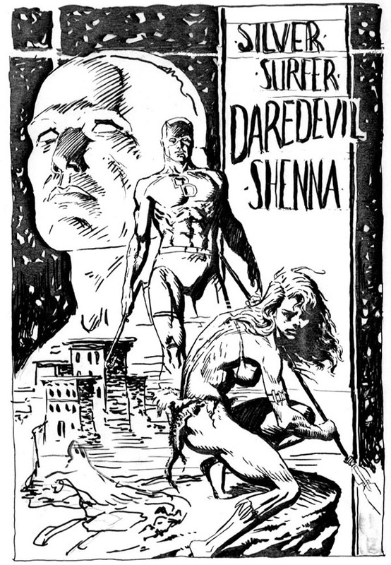
I'd never drawn the Wolverine before and I pretty much blew it. He's a short, thick guy and the proportions I gave him are all wrong. On the other hand, the back cover still intrigues me. It was an experiment and it broke from the standard look of a comic cover. But it doesn't quite look like a poster or a splash page or a trade paperback book cover and I like that hard-to-pin-down quality. 

Despite the hundreds (?) of comic cover that hit that stands each month,  there's still a certain uniformity to most of them. Part of me is curious to see if I indeed could contribute something original if I were doing covers again. Part of me is a wimp who has no desire to once more join the fray once more and try and find that sort of work.


Marvel Comics Presents Vol 1 #69-related images from Sandy's archive are below
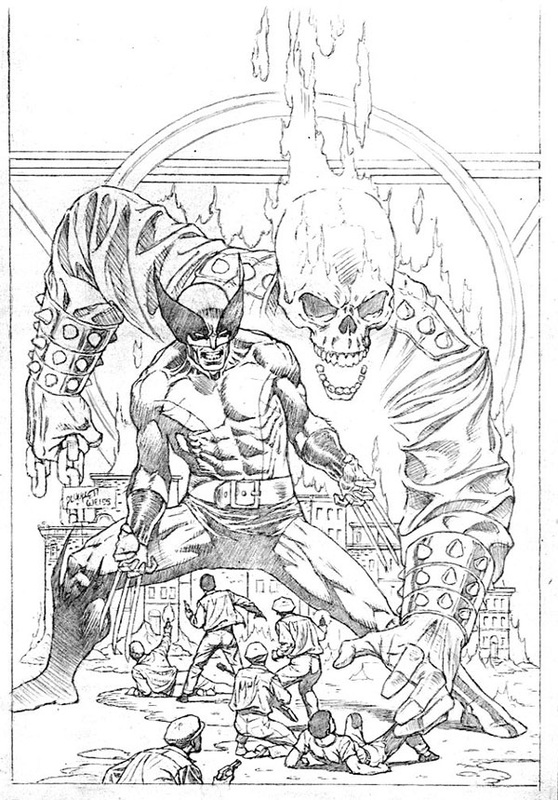
wolverine and ghost rider by sandy plunkett
Sandy's cover pencils
color guide - wolverine and ghost rider by sandy plunkett
Sandy's cover color guide
ink rough - drawing of silver surfer, daredevil, and shenna by sandy plunkett
Sandy's ink rough for back cover

A look back: Spectre Vol 3 #3

8/15/2015

 
spectre #3 cover by sandy plunkett
Taking a break from reviewing Athens, Ohio, or Marvel work, Jim asked Sandy about his work on 1993's Spectre [Vol 3] #3 cover for DC Comics.
  • Had you done work for DC prior to this?
  • Were you still in NY when you did this?
  • Were you a fan of the Spectre?
  • Do you recall if you did a lot of sketches for this?
  • Were you trying to convey any particular 'message' with the art?

Sandy:

I'd done some work for DC before I got a call to do this cover. Neal Adams helped get me my first job for the company. He had this deal with them -- if they gave a script to an aspiring artist he thought had promise, he would ink the resulting pencils, thus guaranteeing that even if the guy turned out not so promising, Neal would save the job with his inks.

I think I had moved to Ohio by the time I'd received the assignment and never did meet the editor. We didn't establish the best of relationships but I don't remember the reason for the friction. Deadline issues? Quality? What I do remember is this: a couple days after the cover hit the stands, I got a phone a call. Picked up the receiver and a very distinctive voice came through the other end, "Hi, this is Harlan Ellison."  

Fans of science fiction of the late 60's through the  80's will recognize that name as a preeminent writer and media critic of the time. He was/is a tremendous fan of Golden Age characters and wanted to buy the original. I happily obliged. And thus, whatever the editor thought about the cover, I was feeling pretty smug, having received  validation from such a esteemed fan favorite.

I did a fair number of roughs before I managed to come up with something that expressed what I felt was the intrinsic nature of the character- an awful (in the biblical sense) instrument of divine judgement and retribution.


Spectre Vol 3 #3-related images from Sandy's archive are below
spectre cover roughs
Three roughs which should let you see how the idea for the final version evolved.
inking rough of spectre cover
Inking rough done with an old brush on parchment, used to work out black and white placement.
spectre vol 3 #3 cover final pencils
Final pencils
spectre vol 3 #3 cover - sandy's pencils with his inks
Pencils with Sandy's inks

A look back: Defenders Vol 1 #124

8/11/2015

 
Picture
With the recent announcement that Netflix is bringing Marvel's "Defenders" to its services, Jim thought he would ask Sandy about a 1983 Defenders cover.
  • Were you in NY when you did this cover?
  • What else was happening at Marval at the time?
  • Who did you work with on this issue?
  • What kind of team were The Defenders... for those of use that mostly know about the X-Men, FF, Avengers, Alpha Flight, and X-Force.
  • This is pretty diverse cover: man, woman, animal beast, alien beast... was it hard making it all "work?"

Sandy:

Carl Potts was the editor on the Defenders book, a buddy from our days at Neal Adams' Continuity Studios, and if I recall correctly, he pretty much gave me free rein on the cover, letting me do a "symbolic" representation of the group. That is, the scene I came up with didn't have to depict any actual event in the issue.

Even by superhero standards, the Defenders was a weird-ass group. I could never get a read on that book (though, yes, it might have helped if I had actually read any of the stories.) The original creators took the most unlikely characters and tossed them into the same title. And the composition of the group seemed to change with mind-spinning regularity. Fortunately, I was under no pressure to include all the team members on the cover and so I cherry-picked, selecting the ones I thought would work well together visually.

Alan Weiss did another stellar job inking my pencils and I colored it, as I did all my covers.

Years later, a fan commissioned me to do a recreation of the cover. This practice might sound odd to the uninitiated, but fans who missed out on buying the original of a favorite cover sometimes hire the artist to "recreate" the work for them. I have mix feeling about this idea. On the one hand, redrawing a piece gives you the chance to work out all the annoying flubs you committed the first time round. On the other hand, given my propensity for spending an absurd amount of time worrying about minutia, reworking a piece until I get it right isn't a good idea. 
When I'm at the board sometimes, late at night, I imagine myself some retched character from an Edgar Allan Poe story, neurotically reworking details no one will ever notice on a drawing  that'll never be finished.

Though I did improve some of the drawing in the recreated version of this cover, my preference is for the original, largely cause Alan's inks are just so gritty and rich with texture.


Defenders #124-related images from Sandy's archive are below
Picture
Above: Sandy Plunkett's original Defenders cover version, with Weiss' inks
Picture
Above: Sandy's color guides for the separators
Picture
Above: Recreated Defenders cover
<<Previous

    BLOG

    about

    Plunkett-fan Jim Harris interviewing Sandy about past and present projects.

    Archives

    July 2026
    June 2026
    January 2021
    September 2020
    June 2020
    November 2019
    August 2017
    June 2017
    May 2017
    February 2017
    December 2016
    August 2016
    April 2016
    March 2016
    February 2016
    January 2016
    December 2015
    November 2015
    October 2015
    September 2015
    August 2015
    July 2015
    July 2014

    Categories

    All
    1980s
    1990s
    Alan Weiss
    Al Milgrom
    Ant-Man
    Archie Goodwin
    Athens Ohio
    Bobbie Chase
    Bob Harras
    Carl Potts
    Color
    Color Guide
    Comic
    Cover
    DC
    Defenders
    Finished
    Finished Ink
    Finished Pencil
    Ink
    In Use
    Jim Shooter
    Logos & Labels
    Marvel
    Marvel Comics Presents
    Mike Higgins
    Never Before Published Artwork
    New Universe
    Nightmask
    P. Craig Russell
    Pencil
    Rough
    Rough Pencil
    Spectre
    Spider Man
    Spider-Man
    Steve Ditko

    RSS Feed

Sandy Plunkett--comic book artist living in Athens, Ohio
More artwork, and some stories, are in the blog
  • Portfolio
    • Commission 1
    • Commission 2
    • Commission 3
    • Eclectica 1
    • Eclectica 2
  • Links
  • Blogs
    • Blog
    • "Pizza Boy" Posts
  • Contact
  • Books