|
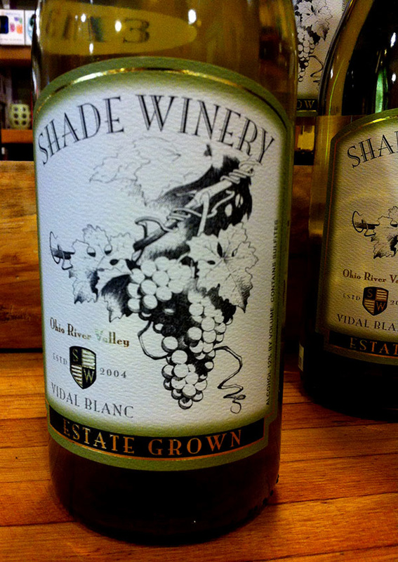
After seeing this new Shade Winery label/bottle on a shelf at the Village Bakery (Athens, Ohio), Jim asked Sandy about this recent wine label project.
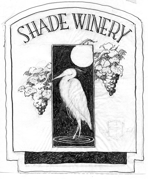
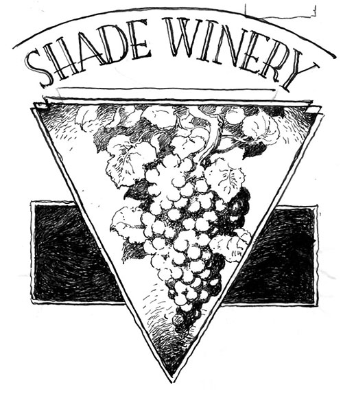
Sandy: Well, technically, it was the third label for Shade Winery, though the second, a drawing of a ginseng root, never made it onto a bottle. Don't know why. I referenced the hell out of this drawing- "Googled" grapes, leafed through magazines devoted to grape growing (you wouldn't believe how many there are!) and went to Kroger and bought bunches to take home and sketch. I dreamed grapes. This was a tough assignment. I found trying to capture the texture of grapes in ink next to impossible. They kept coming out looking like gum balls. In fact, the grapes on my label STILL look like gum balls. I showed Neal Dix (the owner of Shade Winery) a number of different sketches before he settled on the idea of having grapes as the sole element on the label. And from there, a fair amount of time was spent refining the arrangement and design. The label might be 'just grapes', but trust me when I say that this wasn't the easiest job I ever did. I've trained myself to work for about a 35% reduction, so the original drawing is about a third larger than the label, maybe 7"x9". (Thirty-five percent is the standard reduction the original artwork for comics receives so that's more or less become ingrained in my work method.) I used India ink over a pencil drawing, applying the ink with a crowquill dip pen. And lastly, there was no free wine...but I'm not much of a wine drinker! Neal was a good guy to work for, so even though getting the drawing to work just right was a pain in the butt, working for Neal was pleasant. Two preparatory roughs for final version of the Shade Winery wine label: Three pieces from Sandy's files related to his work on 1986's "The Official Marvel Index to Marvel Team-Up" #3, discussed in a previous post.
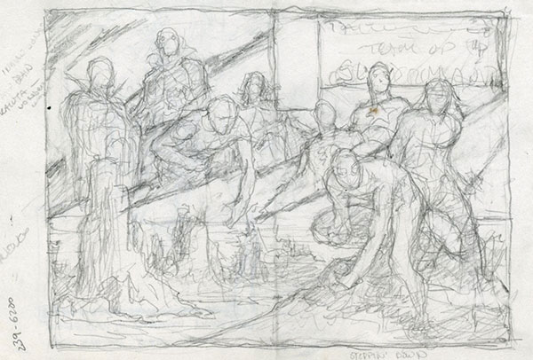
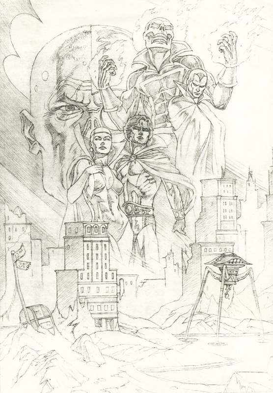
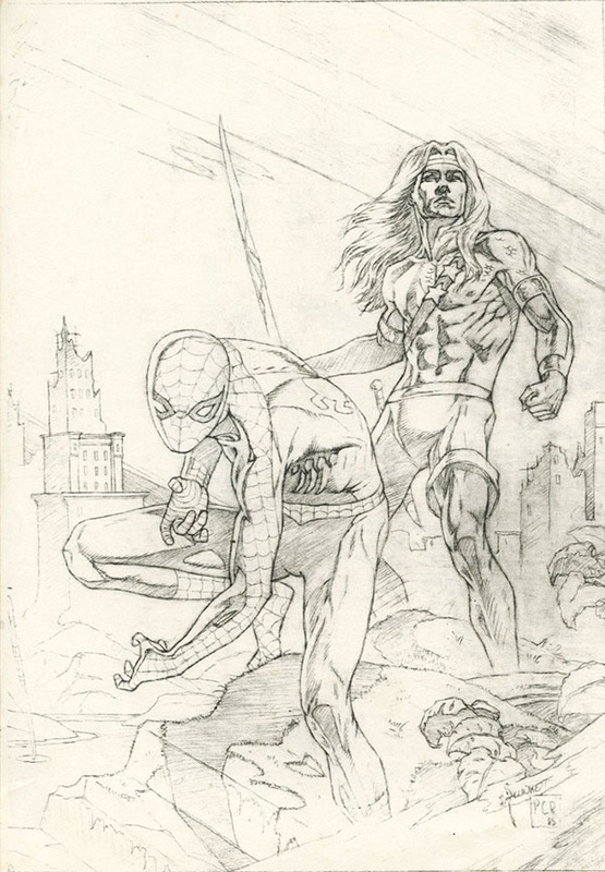
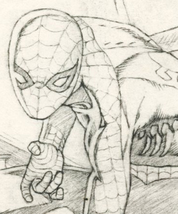
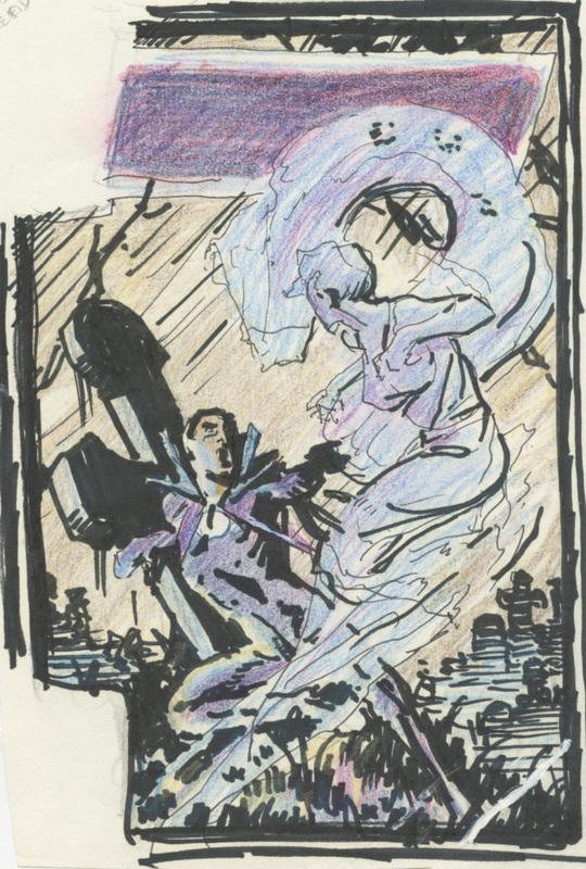
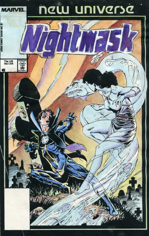
The first image is the rough for the Spider-man/Index Team Up cover and the next two, photocopies of the finished pencils. The last image is a close-up of Spider-Man from the finished pencils. Two Nightmask pieces from Sandy's files. For more of the story, view this previous post.
The first image is the initial rough sketch of the cover. The second image is Sandy's original color guide for Marvel. |
BLOGaboutPlunkett-fan Jim Harris interviewing Sandy about past and present projects. Archives
January 2021
Categories
All
|
 RSS Feed