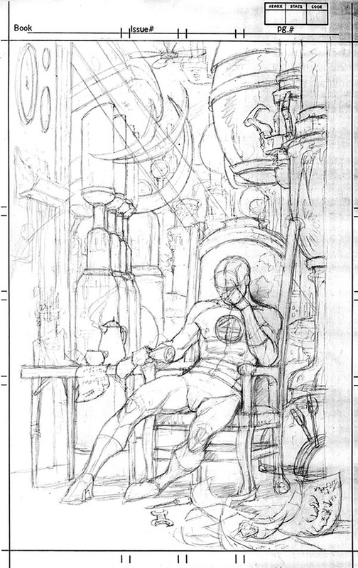
 Jim asked Sandy about a sketch he did of the Fantastic Four's Mr. Fantastic. Sandy: In the mid 80's, editor Al Milgrim decided to go with an all pin-up issue on Marvel Fanfare. The artists assigned were given carte blanc- no restriction on characters or other content. This drawing of Mr. Fantastic was the first sketch I came up with. Thought it was a pretty neat idea, fairly original given most pin-ups being done were full of fists and fury. This was more cerebral, and if successful, it would pull at the viewers heartstrings. But it dawned on me that it probably would communicate with maybe 2% of the audience, those who knew that one of the great superhero melodramas involved the relationship that existed between Reed Richards and Ben Grimm (aka The Thing). Reed had been responsible for Ben's transformation into the monstrous Thing and thus separating the tormented Ben from the rest of humanity. Much space in early issues of the Fantastic Four was devoted to Reed's attempts (and failures) to reverse the process. Tragedy on a Shakespearian level. Really! Anyway, the drawing was meant to depict Reed at a point of despair, presumably having been frustrated once more in his attempts to come up with the right formula to help his good buddy reenter humanhood. Much as I liked it, I just didn't think people would get it. So, I went this a drawing of the Scarlet Witch, surrounding by primordial familiars (she is a witch, after all). There was an option of doing full color on these pin-ups and so my original black and white art was developed into a "blue-line", which meant that you, the artists, painted onto a blue reproduction of the art with the black line work printed on a separate acetate overlay. Hellish way to color. Scarlet Witch from Marvel Fanfare #45 below (posted by Comicsagogo.com), along with two pieces from Sandy Plunkett's collection. 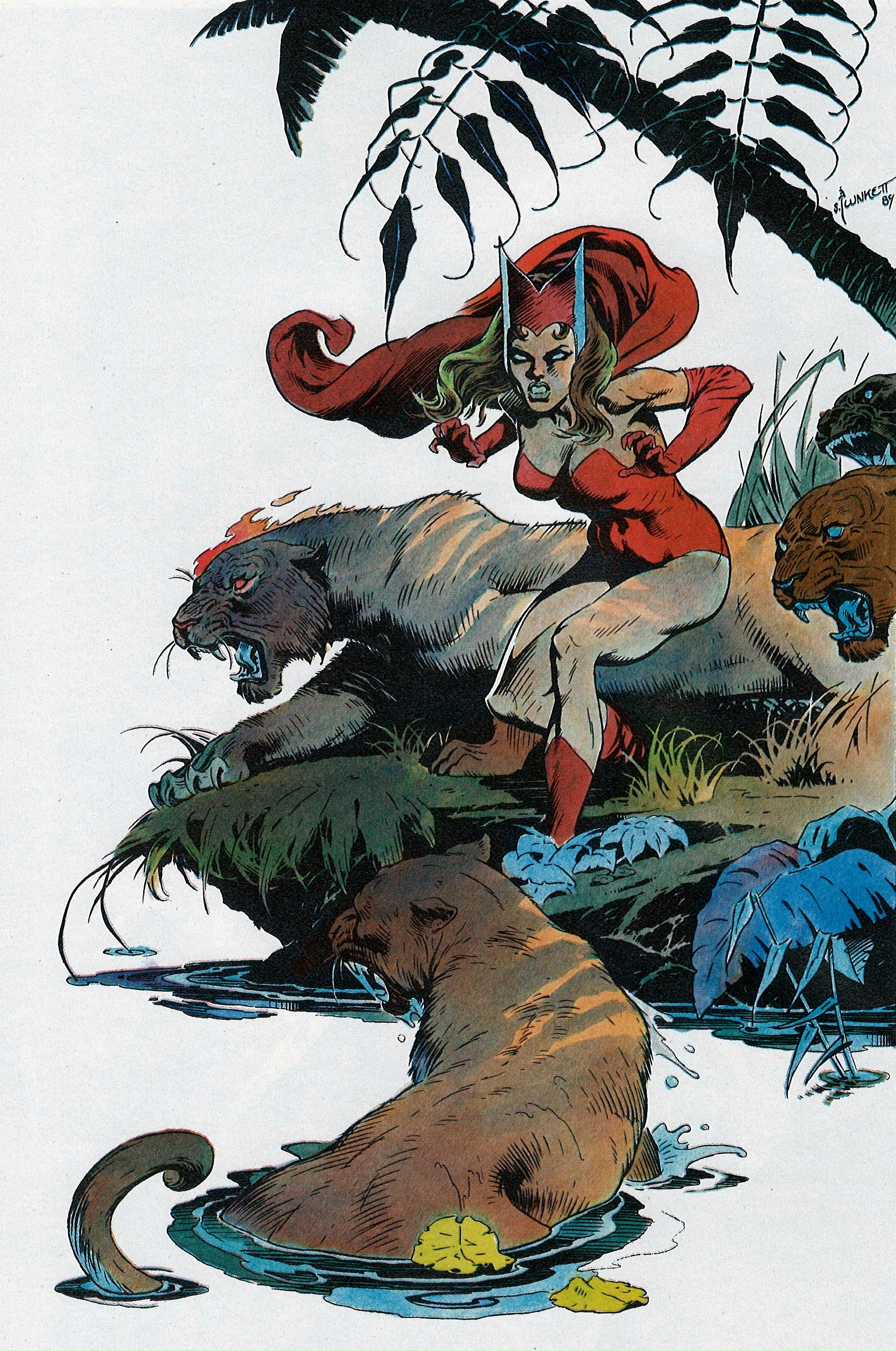 Scarlet Witch By Sandy Plunkett in 1989's Marvel Fanfare #45, a Pinup Issue 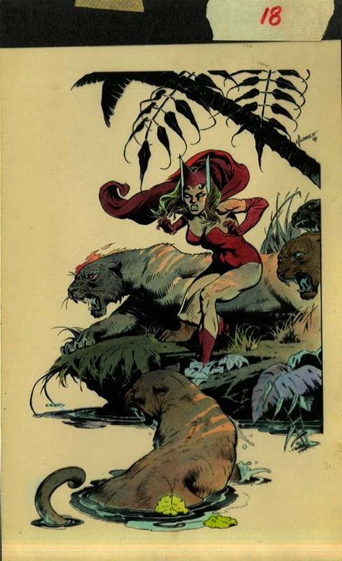 Sandy's Scarlet Witch -- Original blue-line coloring, acetate in place 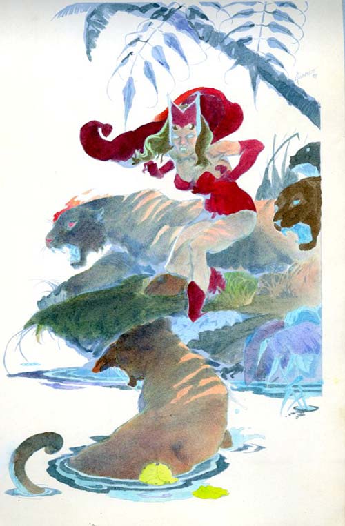 Sandy's Scarlet Witch -- Coloring with acetate lifted off 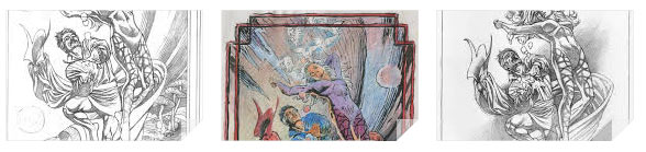 Jim asked Sandy about three Dr. Strange images, which are included below. Sandy: These images bring back bittersweet memories. I had gotten a plum job: In the mid 80's a company called First Team was hiring comic artist to do prints (high quality posters) of Marvel characters. Good pay, high prestige. But it was one of those times in a young artist's like when the highs and lows of a turbulent romance were playing havoc with his ability to produce. The folks at First Team were cutting me all sorts of slack but I just kept blowing the deadlines. But I liked the idea a lot, Dr. Strange and his lithesome protege Clea, frolicking in some Ditkoesque dimension, the good doctor enchanting her a bit of stage magic from Vaudeville. Years later, I stumbled on the roughs and thought the idea was too good to go unused. I simplified the composition, settled on doing it just in pencil, and sold the original at a convention (too cheaply!). Dr. Strange and Clea from Sandy's archive: 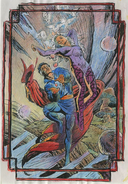 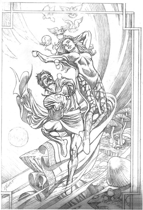 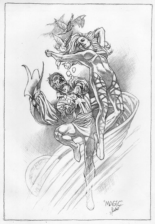 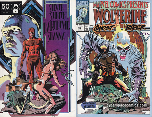 Jim asked Sandy for his thoughts on his Marvel Comics Presents cover from 1991. Sandy: Not too much to say about this cover really. I believe it was the last one I did for Marvel before moving to Ohio and it's not a favorite of mine. The issue contained the first installment of a four part Daredevil story I wrote, laid out and eventually colored. (My apologies to all those who read this story, by the way- it was a real dog. Whatever I might have learned in the writing of my earlier efforts, I seemed to have totally forgotten on this one.) I'd never drawn the Wolverine before and I pretty much blew it. He's a short, thick guy and the proportions I gave him are all wrong. On the other hand, the back cover still intrigues me. It was an experiment and it broke from the standard look of a comic cover. But it doesn't quite look like a poster or a splash page or a trade paperback book cover and I like that hard-to-pin-down quality. Despite the hundreds (?) of comic cover that hit that stands each month, there's still a certain uniformity to most of them. Part of me is curious to see if I indeed could contribute something original if I were doing covers again. Part of me is a wimp who has no desire to once more join the fray once more and try and find that sort of work. Marvel Comics Presents Vol 1 #69-related images from Sandy's archive are below 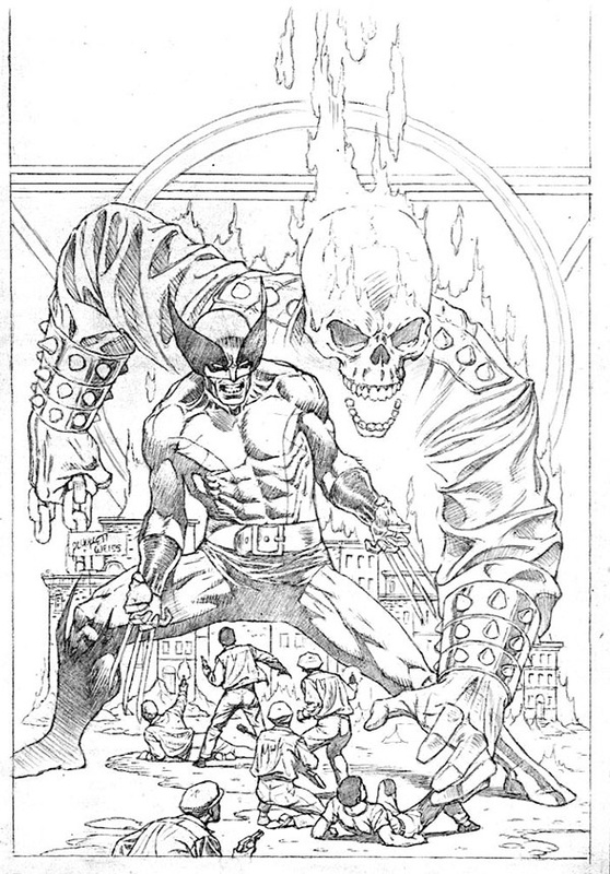 Sandy's cover pencils 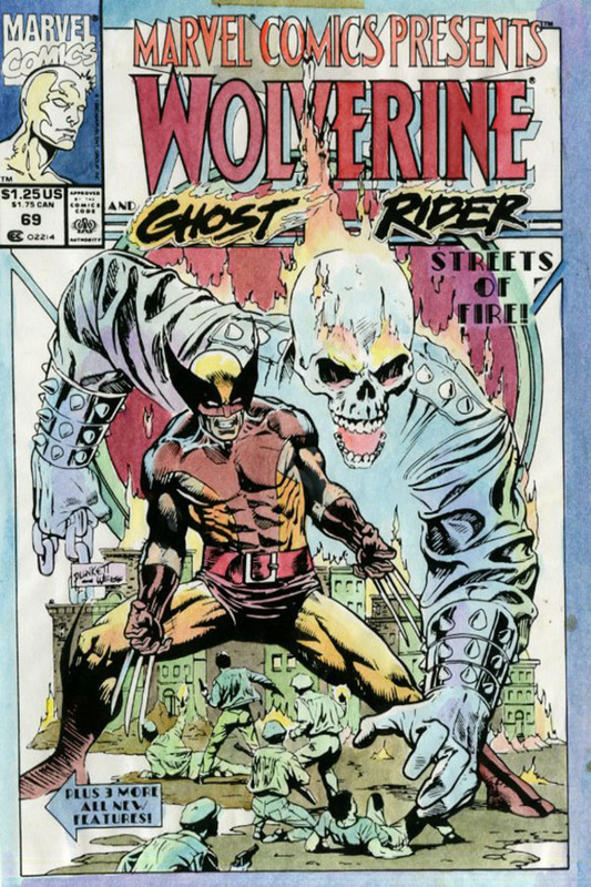 Sandy's cover color guide 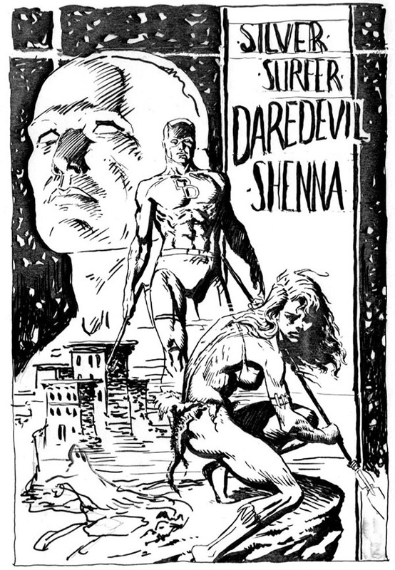 Sandy's ink rough for back cover |
BLOGaboutPlunkett-fan Jim Harris interviewing Sandy about past and present projects. Archives
January 2021
Categories
All
|
 RSS Feed